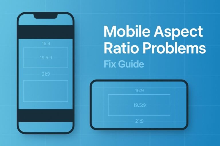
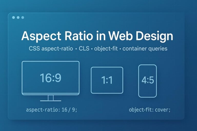
Summary: In modern web design, aspect ratio is the width-to-height relationship of a box (e.g., 16/9, 1/1). The native CSS aspect-ratio property lets you lock shapes for cards, images, videos, and placeholders so layouts stay stable and responsive. Pair it with width/height attributes on images to prevent CLS, and add object-fit/object-position for clean crops. This guide shows exactly how.
What “aspect ratio” means in web UI
Aspect ratio is the proportional relationship between width and height. In CSS you can express it as a ratio value like 16 / 9 or 1 / 1. When a box has a ratio and only one dimension is known, the browser derives the other automatically, keeping the shape consistent across responsive breakpoints.
Why aspect ratio matters for UX, CLS & SEO
- No layout jumps: Pre-allocating space for media prevents cumulative layout shift (CLS).
- Design consistency: Grids with fixed shapes (e.g., 4/3 thumbnails) look tidy even when source images vary.
- Better Core Web Vitals: Stable layouts support a stronger Page Experience signal.
Best practice: Always include width and height attributes on <img> so browsers infer the intrinsic aspect ratio and reserve space before the image file finishes loading.
Modern CSS: the aspect-ratio property
Use aspect-ratio on any element to declare its preferred width-to-height relationship. If one dimension is auto or omitted, the other is computed from the ratio.
.ratio-1-1 { aspect-ratio: 1 / 1; }
.ratio-16-9 { aspect-ratio: 16 / 9; }
.ratio-4-5  { aspect-ratio: 4 / 5; }
Support: All modern browsers support aspect-ratio. IE never did (and is no longer targeted by most sites). If you truly need an IE fallback, use the padding-top hack behind a helper class.
Copy-paste patterns
1) Uniform card thumbnails (no distortion)
.card__media { aspect-ratio: 4 / 3; overflow: hidden; }
.card__media img { width: 100%; height: 100%; object-fit: cover; object-position: center; }
2) Responsive images that don’t shift layout (CLS-safe)
Add explicit size attributes. The browser infers the intrinsic ratio and reserves space even before CSS applies.
<img
  src="/images/hero-1920x1080.jpg"
  width="1920" height="1080"
  alt="Product hero"
  loading="lazy"
  decoding="async"
/>
Let the image scale responsively without stretching:
img.hero { max-width: 100%; height: auto; }If you need a different box shape than the intrinsic one, add:
.hero-frame { aspect-ratio: 21 / 9; }
.hero-frame img { width: 100%; height: 100%; object-fit: cover; }
3) Video & embeds (YouTube, iframes, maps)
.embed { aspect-ratio: 16 / 9; }
.embed iframe, .embed video { width: 100%; height: 100%; }
4) Full-bleed banners & hero sections
.hero {
  aspect-ratio: 21 / 9;
  background: url('/img/banner.jpg') center/cover no-repeat;
}
5) Square avatars, round crops
.avatar { aspect-ratio: 1 / 1; width: 96px; border-radius: 50%; overflow: hidden; }
.avatar img { width: 100%; height: 100%; object-fit: cover; }
6) Product gallery tiles (mixed source sizes)
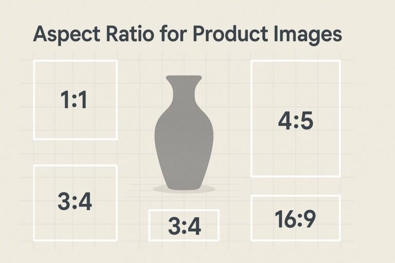
.grid { display: grid; gap: .75rem; grid-template-columns: repeat(4, 1fr); }
.tile { aspect-ratio: 3 / 4; }
.tile img { width: 100%; height: 100%; object-fit: cover; }
Media & container queries with aspect ratio
Viewport media queries
Target tall vs. wide viewports using the aspect-ratio media feature:
@media (max-aspect-ratio: 1 / 1) {  /* portrait-ish viewports */
  .sidebar { display: none; }
}
Component-level container queries
Make components adapt to their container (not the whole viewport). You can query a container’s size—including its aspect ratio—once you declare it as a query container.
.card { container-type: size; }

@container (aspect-ratio > 1 / 1) {
  .card__layout { grid-auto-flow: column; } /* landscape container */
}

@container (aspect-ratio <= 1 / 1) {
  .card__layout { grid-auto-flow: row; }    /* square/portrait container */
}
Design tokens & common ratios
Standardize ratios as tokens so designers and developers stay aligned. Example tokens:
--ratio-square→1 / 1(avatars, icons)--ratio-thumb→4 / 3(card media)--ratio-photo→3 / 2(photography)--ratio-video→16 / 9(landscape video)--ratio-portrait-feed→4 / 5(social feed)--ratio-hero→21 / 9(cinematic banners)
Need quick math? Use the Aspect Ratio Calculator to convert between pixels and ratios when documenting tokens.
Gotchas & debugging tips
- Which value “wins”? The ratio influences auto sizes. If you set both explicit
widthandheight, the ratio won’t change the box. - Replaced elements (img/video): They have intrinsic sizes. Use
object-fit: cover+object-positionto crop elegantly inside a ratio box. - Legacy fallback: For IE-only environments, use the padding-top trick (
position: relative+padding-top: 56.25%for 16:9) and absolutely positioned content. Hide this behind an IE-targeted class. - CLS audits: After rollout, verify field data (Chrome UX Report) and lab data (Lighthouse) to keep CLS < 0.1.
Implementation checklist
- ✅ Add
width/heightattributes to<img>so the browser knows the intrinsic aspect ratio. - ✅ Use CSS
aspect-ratioon layout boxes that need consistent shapes (cards, placeholders, embeds). - ✅ For cropping, add
object-fit: coverand tweakobject-positionfor focal points. - ✅ Prefer container queries for component adaptiveness; use media queries for viewport-level changes.
- ✅ Confirm CLS in production and fix any late-loading UI that nudges content around.
FAQs
Does aspect-ratio work in all modern browsers?
Yes—current Chromium, Firefox, and Safari versions support it. Internet Explorer never did and is generally out of scope in 2025.
Is aspect-ratio better than the padding-top hack?
Yes. Native CSS is clearer, less error-prone, and more accessible. Keep the hack only for extreme legacy support.
How do I stop image “jumps” as pages load?
Include width/height on <img> so the browser reserves space. Layer CSS for layout or cropping.
How do I fill a box without distortion?
Use object-fit: cover to crop edges while preserving ratio, or contain to letterbox/pillarbox.