Confused between 1:1 and 4:5? This guide shows exactly which aspect ratio to use for product images, why it matters for conversions and Core Web Vitals, and how to implement it in WordPress without layout shift.
Quick takeaways
- Use one consistent ratio for product grids (PLP/collection). The safest default is 1:1; choose 4:5 for tall apparel or where vertical framing outperforms.
- Prevent CLS: Always include
widthandheightor a container withaspect-ratio; setobject-fit: cover. - Export smart: WebP (or AVIF where supported), sRGB, and 2–3 responsive sizes via
srcset. - Consistency wins: Same crop, margins, and background across variants boosts perceived quality and CTR.
What is an aspect ratio?
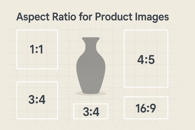
Aspect ratio describes the proportional relationship between an image’s width and height. Examples: 1:1 (square), 4:5 (portrait), 3:4 (slightly tall), 16:9 (landscape).
Formula: Given width W and ratio a:b, the height is H = W × (b ÷ a). So at W = 1200 and ratio 4:5, H = 1200 × 1.25 = 1500.
Why aspect ratio matters for ecommerce
- Clean product grids: Uniform tiles reduce visual noise and help shoppers scan faster.
- Higher conversions: Consistent framing improves CTR and trust.
- Core Web Vitals: Preserving space with intrinsic dimensions or
aspect-ratioeliminates layout shifts. - Cross-channel fit: A good base ratio adapts neatly to ads, social, and comparison engines.
Best aspect ratios for product images
Choose one ratio for list/grid pages; mix only inside PDP galleries if you must.
| Scenario | Recommended ratio | Why |
|---|---|---|
| Mixed catalog / default thumbnails | 1:1 | Most themes expect squares; universally compatible. |
| Apparel / tall subjects | 4:5 | Vertical framing shows full garments; more mobile screen real estate. |
| Detail shots / lifestyle | 3:4 | Natural portrait feel without being too tall. |
| Hero banners / category covers | 16:9 | Great for wide hero areas; keep product cards 1:1 or 4:5. |
If unsure, go 1:1 for product cards and the first gallery image on PDPs. It’s the most resilient choice.
Recommended sizes & exports
Export at ~2× your largest expected display to future-proof for high-DPI screens, then serve appropriately via srcset.
| Use case | Aspect ratio | High-res | General | Lightweight |
|---|---|---|---|---|
| Catalog cards / PDP primary | 1:1 | 2048×2048 | 1600×1600 | 1200×1200 |
| Vertical apparel | 4:5 | 2000×2500 | 1600×2000 | 1080×1350 |
| Flexible portrait | 3:4 | 1920×2560 | 1500×2000 | 1200×1600 |
| Hero / feature (not cards) | 16:9 | 2560×1440 | 1920×1080 | 1280×720 |
- Format: WebP (primary); consider AVIF where supported. JPEG fallback only if needed.
- Color: sRGB, consistent neutral background.
- Target file size: ~60–120 KB (catalog), ~150–250 KB (PDP hero), where feasible.
Cropping & composition rules
- Uniform padding: Keep 3–5% breathing room around products.
- Center the subject for main images; off-center only when highlighting a feature.
- No edge kisses: Avoid touching frame edges; it can look cramped and auto-crop badly.
- Consistent angles across variants to reduce buyer friction.
- Clean backgrounds: Dust-free, color-consistent backdrops improve perceived quality.
Implementation (HTML, CSS & WordPress)
1) Prevent layout shift with intrinsic dimensions
Always include width and height so browsers reserve space before the image loads.
<img
  src="/images/shirt-1600x2000.webp"
  alt="Navy linen shirt on hanger, front view"
  width="1600" height="2000"
  loading="lazy"
  decoding="async"
  srcset="/images/shirt-800x1000.webp 800w,
          /images/shirt-1200x1500.webp 1200w,
          /images/shirt-1600x2000.webp 1600w"
  sizes="(max-width: 600px) 50vw, (max-width: 1024px) 33vw, 25vw"
/>
2) Use a ratio box for flexible grids
.product-card .media {
  aspect-ratio: 1 / 1; /* or 4 / 5, 3 / 4 */
  overflow: hidden;
  background: #f6f7f8;
}
.product-card .media img {
  width: 100%; height: 100%;
  object-fit: cover; object-position: center;
}
3) WordPress & WooCommerce
- Choose one ratio (e.g., 1:1) in your theme/WooCommerce image settings and enable hard crop.
- Upload large originals (e.g., 2000–2500px long side) so WordPress can generate crisp responsive sizes.
- Serve next-gen formats: Many hosts/plugins enable WebP/AVIF and on-the-fly compression.
- Regenerate thumbnails after changing crop settings so the grid updates everywhere.
Speed & SEO checklist
- Use a single aspect ratio for product images in grids (usually 1:1).
- Include
widthandheightor a CSSaspect-ratiowrapper. - Export WebP (consider AVIF); keep originals in sRGB.
- Serve responsive images with
srcset/sizes; lazy-load below the fold. - Keep file sizes lean; compress with an image CDN or build tool.
- Write descriptive alt text (object, angle, color) without keyword stuffing.
- Keep backgrounds and margins consistent across variants.
- A/B test 1:1 vs 4:5 on mobile for apparel/tall products.
FAQ
What is the best aspect ratio for product images?
For most stores, 1:1 is the best default for product cards and the first PDP image. Consider 4:5 when vertical framing better showcases the item (e.g., apparel).
Can I mix aspect ratios?
Use one ratio for grids to avoid layout jank. Inside PDP galleries, you can mix ratios for detail shots—just keep the first image standardized.
What size should I export?
Common sweet spots: 1600px on the long side for catalogs, 1920–2048px for PDP hero images. Provide multiple sizes via srcset.
How do I avoid layout shift (CLS)?
Always reserve space with width and height attributes or wrap images in a container using CSS aspect-ratio. Use object-fit: cover so crops remain tidy.
What about alt text for product SEO?
Describe what’s visible: item type, color/material, angle, key feature. Example: “Black leather ankle boots, side angle, close-up of stitching.”