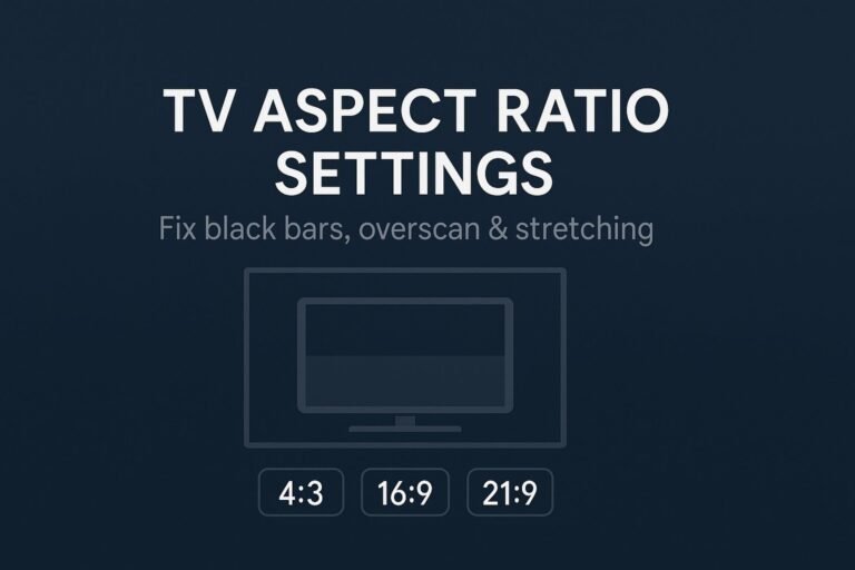
If your site shows black bars, stretched images, cropped videos, or full-height sections that cut off on phones, you’re facing mobile aspect ratio problems. This step-by-step guide explains the causes and gives you copy-paste fixes for CSS, web apps, and native frameworks.
Key takeaways
- Give images intrinsic dimensions with
widthandheightattributes to lock the correct ratio and prevent CLS. - Use CSS
aspect-ratioor a ratio wrapper to keep videos, iframes, and cards in shape. - Replace brittle
100vhon mobile with100dvh(and keep a100vhfallback). - Handle notches using
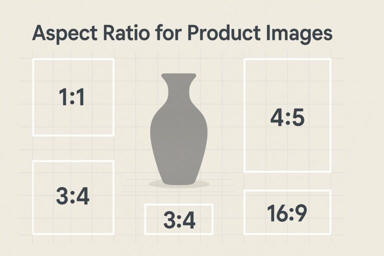
viewport-fit=cover+env(safe-area-inset-*)padding. - Test by aspect ratio (not size alone): tall 3:4, common 16:9–20:9, and ultrawide 21:9.
Why mobile aspect ratio problems happen
- Device fragmentation: phones vary from 4:3 to 21:9 with notches and rounded corners.
- Missing intrinsic sizes: without known
width/height, browsers can’t reserve space → crops/CLS. - Using the wrong fit:
containvscovervsfillbehave very differently. - Viewport height quirks: mobile toolbars make
100vhunreliable. - Embeds/iframes: third-party players default to desktop ratios.
Images: no stretching, no layout shifts
Give the browser the image’s real pixel size. It uses those numbers to calculate the intrinsic aspect ratio and prevent unexpected jumps.
<img
  src="/images/hero-1920x1080.jpg"
  width="1920" height="1080"
  alt="Showcase of the app on a mobile phone"
  loading="lazy" decoding="async"
  style="max-width:100%;height:auto;object-fit:cover;" />
Lock the box with CSS aspect-ratio
.card-media {
  width: 100%;
  aspect-ratio: 16 / 9;   /* 4/3, 1/1 also common */
  object-fit: cover;       /* use contain for diagrams/logos */
  border-radius: 12px;
  overflow: hidden;
}
Fallback ratio box
.ratio { position: relative; width: 100%; }
.ratio::before { content:""; display:block; padding-bottom:56.25%; } /* 16:9 */
.ratio > img, .ratio > video { position:absolute; inset:0; width:100%; height:100%; object-fit:cover; }
Art direction with <picture>
<picture>
  <source media="(max-width:480px)" srcset="/img/hero-4x5.jpg">
  <source media="(min-width:481px)" srcset="/img/hero-16x9.jpg">
  <img src="/img/hero-16x9.jpg" width="1600" height="900" alt="Hero image">
</picture>
Background images without awkward crops
Decide if you want full-bleed or full image preservation.
.hero {
  background: url('/img/hero.jpg') center 30% / cover no-repeat;
  aspect-ratio: 16 / 9; /* optional: enforce a shape for predictable crops */
}
.hero--preserve { background-size: contain; background-color: #0e0e0e; }
Responsive videos & iframes
Simple (modern): apply aspect-ratio directly
.video { width: 100%; aspect-ratio: 16 / 9; border: 0; }
<iframe class="video"
  src="https://www.youtube.com/embed/VIDEO_ID"
  title="Product demo"
  allowfullscreen></iframe>
Classic wrapper (works everywhere)
.video-wrap { position:relative; width:100%; }
.video-wrap::before { content:""; display:block; padding-bottom:56.25%; }
.video-wrap > iframe { position:absolute; inset:0; width:100%; height:100%; border:0; }
Full-height sections: fixing the 100vh bug
Mobile browsers change the viewport when toolbars appear/disappear. Use dynamic units with a fallback.
.full-height {
  min-height: 100vh;   /* fallback */
  min-height: 100dvh;  /* dynamic viewport height on mobile */
  display: grid; place-items: center;
}
@supports (height: 100svh) {
  .full-height { min-height: 100svh; } /* small viewport, often best for sticky UI */
}
Notches, rounded corners & safe areas
<meta name="viewport"
  content="width=device-width, initial-scale=1, viewport-fit=cover">
header, footer, .screen {
  padding-top: env(safe-area-inset-top);
  padding-right: env(safe-area-inset-right);
  padding-bottom: env(safe-area-inset-bottom);
  padding-left: env(safe-area-inset-left);
}
Keep navigation and buttons inside the padded area so they never sit under the notch or curved corners.
Media queries by aspect ratio & orientation
/* Tall phones (story-like) */
@media (max-aspect-ratio: 3/4) {
  .sidebar { display: none; }
  .toolbar { height: 56px; }
}
/* Ultrawide 20:9+ */
@media (min-aspect-ratio: 20/9) {
  .hero { aspect-ratio: 21 / 9; }
  .copy { max-width: 68ch; margin-inline: auto; }
}
/* Landscape tweaks */
@media (orientation: landscape) {
  .gallery { grid-template-columns: repeat(4, 1fr); }
}
Native app snippets (iOS, Android, React Native, Flutter)
iOS (SwiftUI)
Image("cover")
  .resizable()
  .scaledToFill() /* or .scaledToFit() */
  .clipped()
Android
<ImageView
  android:layout_width="match_parent"
  android:layout_height="0dp"
  android:layout_weight="1"
  android:scaleType="centerCrop" />
React Native
const styles = StyleSheet.create({
  media: { width: '100%', aspectRatio: 16/9 }
});
Flutter
AspectRatio(
  aspectRatio: 16/9,
  child: Image.asset('assets/cover.jpg', fit: BoxFit.cover),
)
How to fix mobile aspect ratio problems (10-minute checklist)
- Add intrinsic sizes to all
<img>(width/height attributes). - Apply
aspect-ratioto videos/iframes/cards (or a ratio wrapper). - Switch
100vh→100dvh(with a fallback). - Add viewport meta with
viewport-fit=cover. - Pad with safe-area insets for notched screens.
- Set appropriate
object-fit:coverfor hero photos,containfor charts/logos. - Use aspect-ratio media queries for extreme tall/wide devices.
- Test portrait/landscape, multiple DPRs, and real devices.
- Run Lighthouse to confirm CLS ≈ 0 and stable layout.
- Recheck embeds (YouTube, Vimeo, Maps) inside ratio wrappers.
Common pitfalls
| Symptom | Likely cause | Fix |
|---|---|---|
| Black bars on sides | contain used where full-bleed was intended |
object-fit: cover or background-size: cover |
| Stretched avatars/logos | Only width constrained | Set both dimensions or use aspect-ratio |
| Content under notch | No safe-area padding | viewport-fit=cover + env(safe-area-inset-*) |
| Hero too short on iOS | Static 100vh |
100dvh (or 100svh in @supports) |
| Layout shifts (CLS) | Missing image width/height |
Add intrinsic dimensions |
FAQ
What’s the quickest universal fix for mobile aspect ratio issues?
Add width/height to images, use aspect-ratio (or a wrapper) for media, and switch 100vh to 100dvh with safe-area padding.
How do I keep a full image without cropping?
Use object-fit: contain or background-size: contain and fill the remainder with a complementary background color.
Which phone aspect ratios are most common?
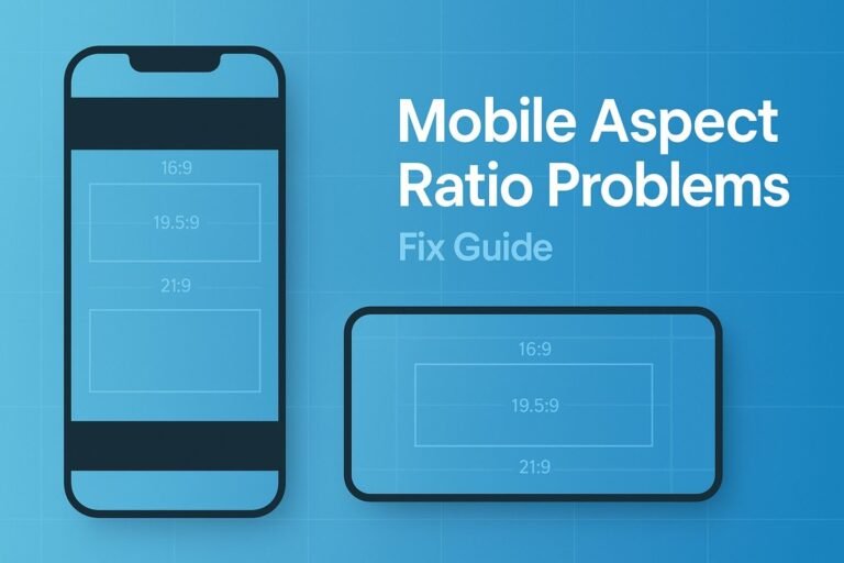
4:3, 16:9, 18:9 (2:1), 19.5:9, 20:9, and 21:9. Design fluidly instead of targeting a single ratio.
How do I calculate an aspect ratio from pixels?
function ratioLabel(w, h) {
  const g = (a,b) => b ? g(b, a % b) : a;
  const d = g(w,h);
  return (w/d) + ':' + (h/d);
}