Nail your mobile game aspect ratio and you’ll ship cleaner HUDs, better camera composition, and higher review scores. This practical 2025 guide covers safe areas, cutouts, foldables, Unity/Unreal setup, FOV math, and a QA matrix so your game looks right on every device.
TL;DR (Key Takeaways)
- Design to a reference resolution (e.g., 1920×1080 for landscape; 1080×1920 for portrait) and reveal more world on wider/taller screens—never stretch.
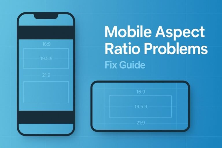
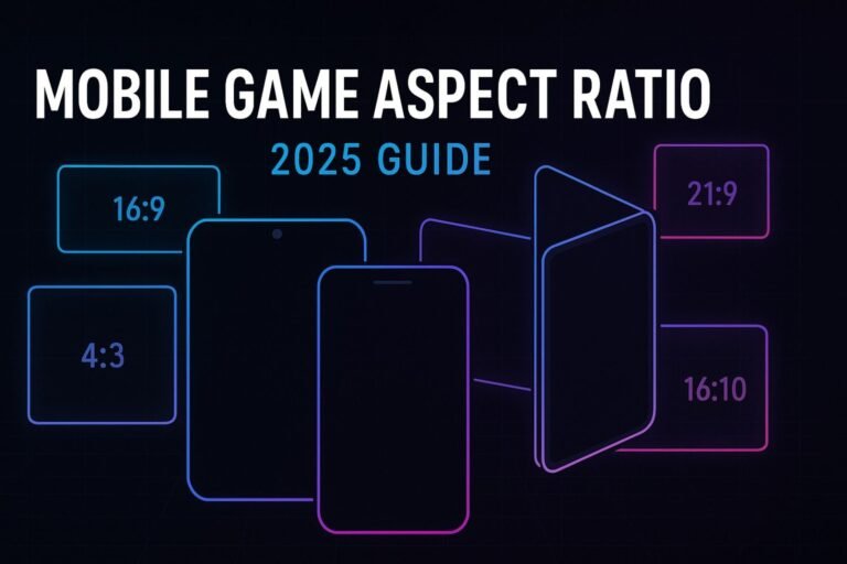
- Support at least 16:9 and the tall-phone range (e.g., 19.5:9–20:9); add 16:10, 4:3 (iPad), and 21:9 for a premium experience.
- Keep interactive HUD inside OS safe areas (iOS safeAreaInsets, Android WindowInsets/DisplayCutout).
- Unity: Canvas Scaler + Safe Area wrapper; Unreal: UMG Safe Zone; validate with device simulators and real phones.
- Ship with a test matrix across aspect buckets and a camera strategy (vertical FOV fixed; horizontal FOV adapts).
What Is a Mobile Game Aspect Ratio?
Aspect ratio is the relationship between a display’s width and height. It’s written like 16:9 (1.78), 20:9 (2.22), etc. Camera composition, UI readability, and competitive fairness all depend on how you handle it.
// aspect = width / height
float aspect = (float)Screen.width / (float)Screen.height;
Common Ratios (Phones, Tablets, PC)
| Ratio | Decimal | Where You’ll See It |
|---|---|---|
| 16:9 | 1.78 | Baseline phones, Google Play Games on PC, TVs/monitors |
| 19.5:9 | 2.17 | Modern iPhones |
| 20:9 | 2.22 | Many Android flagships |
| 21:9 | 2.33 | Ultrawide phones/monitors |
| 16:10 | 1.60 | Android tablets, laptops, Chromebooks |
| 3:2 | 1.50 | Some tablets/laptops |
| 4:3 | 1.33 | iPad family |
Tip: treat these as targets—your camera and UI should adapt fluidly across buckets.
Ratios You Must Support in 2025
- Minimum (landscape): 16:9 → 16:10 → 3:2 → 21:9
- Minimum (portrait): 9:16; include tall-screen tests (19.5:9, 20:9)
- Recommended: cover 4:3 (iPad) and verify Google Play Games on PC at 16:9 windows.
Safe Areas, Notches & Cutouts (iOS & Android)
iOS
- Constrain interactive UI to the safe area (home indicator, rounded corners, notch/dynamic island).
- UIKit:
view.safeAreaLayoutGuide,safeAreaInsets| SwiftUI: use.safeAreaInset()for HUD,.ignoresSafeArea()for scenery.
Android
- Read WindowInsets for status/navigation bars; handle DisplayCutout when rendering edge-to-edge.
- Keep controls inside inset-adjusted bounds; let backgrounds/world art bleed under bars when desired.
Engine Setup (Unity & Unreal)
Unity (URP/Built-in)
- Canvas Scaler: Scale With Screen Size, Reference Resolution e.g.
1920x1080, Match =0.5(or bias to width for landscape 2D). - Anchors: Anchor HUD groups to edges; avoid absolute pixel offsets.
- Safe Area wrapper: place HUD under a panel that fits
Screen.safeArea. - Device testing: Unity Device Simulator + physical phones.
Copy-paste Safe Area script (C#)
using UnityEngine;

[ExecuteAlways]
public class SafeAreaFitter : MonoBehaviour {
  RectTransform rt; Rect last;
  void OnEnable(){ rt = GetComponent<RectTransform>(); Apply(); }
  void Update(){ if (Screen.safeArea != last) Apply(); }
  void Apply(){
    last = Screen.safeArea;
    var canvas = GetComponentInParent<Canvas>();
    Rect r = canvas.pixelRect; Rect sa = last;
    Vector2 min = (sa.position - r.position) / r.size;
    Vector2 max = (sa.position + sa.size - r.position) / r.size;
    rt.anchorMin = min; rt.anchorMax = max; rt.offsetMin = rt.offsetMax = Vector2.zero;
  }
}
Android build: decide if you’ll render under system bars; keep HUD inside the safe wrapper.
Unreal Engine (UMG)
- Wrap UI in a Safe Zone widget to avoid notches/rounded corners.
- Use Scale Box/Size Box for responsive HUD groupings.
- Validate DPI scaling and orientation on real devices.
Layout Strategies That Never Stretch
1) Reference resolution + adaptive camera
Pick a reference (e.g., 1920×1080 landscape). If the device is wider than reference, increase horizontal FOV or reveal more level width. If taller, increase vertical FOV or reveal more height.
2) Three zones
- Action zone: game world edge-to-edge.
- HUD safe zone: strictly inside OS safe areas.
- Bleed zone: decorative art for ultrawide/tall fills.
3) Aspect buckets for HUD
Create presets for 4 buckets: ≤1.60 (16:10), ≤1.78 (16:9), 1.79–2.22 (tall phones), ≥2.23 (ultrawide).
4) 2D scrollers
- Side-scrollers: match height; reveal extra width on wider screens.
- Vertical scrollers: match width; reveal extra height on taller screens.
5) Intentional fallbacks
- Pillarbox/letterbox: fade to theme color, add subtle pattern, or extend background art (no harsh black bars).
- Competitive balance: if ultrawide exposes too much, cap camera or add vignette/scene decor.
Tablets, Foldables & Chromebooks
- Multi-column UI: 1 → 2 → 3 columns as width grows (inventory, map, chat).
- Postures/hinges: avoid placing critical controls across the fold; test half-open modes.
- Reachability: keep primary taps within thumb-friendly zones on large screens.
FOV & Letterbox Math (Quick Formulas)
Letterbox/pillarbox sizing
// Given reference aspect AR and device aspect A
if (A > AR) { // device wider → pillarbox
  float usedWidth = height * AR;
  float side = (width - usedWidth) / 2; // px per side
} else if (A < AR) { // device taller → letterbox
  float usedHeight = width / AR;
  float topBottom = (height - usedHeight) / 2;
}
3D camera conversion
// Keep vertical FOV constant; horizontal FOV adapts with aspect
float hFov = 2f * Mathf.Atan( Mathf.Tan(vFov * 0.5f) * aspect );
Test Matrix & Launch Checklist
| Aspect Bucket | Example Devices | Verify |
|---|---|---|
| 16:9 | Baseline Android, Play Games on PC | No letterbox; HUD aligned; no clipped corners |
| 19.5–20:9 | Modern iPhone/Android flagships | HUD within safe areas; gesture bars don’t overlap |
| 16:10 | Android tablets/Chromebooks | Multi-column layouts; target sizes are finger-friendly |
| 4:3 | iPad family | Readable UI at arm’s length; no distortion |
| 21:9 | Ultrawide phones/monitors | Intentional bleed; PvP advantage mitigated |
Pre-Launch Checklist
- HUD enclosed in safe-area container (Unity script or Unreal Safe Zone).
- Camera reveals more world instead of stretching.
- At least four aspect buckets covered (16:9, tall phone, tablet, ultrawide).
- Store screenshots captured for multiple ratios and both orientations (if supported).
- Localization & long text reflow verified at narrow and tall ratios.
FAQs
What is the best single mobile game aspect ratio to design for?
Use 16:9 (landscape) or 9:16 (portrait) as your reference, then adapt to wider/taller screens with camera and HUD rules.
How do I prevent the notch or dynamic island covering my HUD?
Constrain interactive UI to the OS safe area. It’s fine for background/world art to render under cutouts.
Do I need custom layouts for 21:9?
Often yes—shift HUD inward slightly, add decorative bleed, and cap FOV if ultrawide grants competitive advantages.
How should I handle Google Play Games on PC?
Treat it like another surface: ensure clean 16:9, verify mouse/keyboard prompts, and scale HUD appropriately.