Quick take: Aspect ratio is the shape of a frame (width:height). Resolution is the pixel count (width × height). Set the ratio to match your destination; pick the resolution for detail, file size, and performance.
Key Takeaways (for fast ranking & featured snippets)
- Aspect ratio controls composition and fit (e.g.,
16:9,4:5,1:1). - Resolution controls clarity (e.g.,
1920×1080,3840×2160). - You can change resolution without changing aspect ratio (scale), or change aspect ratio without changing resolution (crop or letterbox).
- Choose the aspect ratio for your platform, then choose a resolution that balances quality and size.
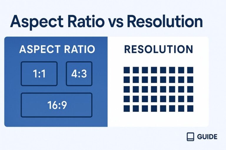
Aspect Ratio vs Resolution: Definitions
What is Aspect Ratio?
Aspect ratio describes frame shape as W:H (width:height). Example: 16:9 means width is 16 units for every 9 units of height. Units are relative; only the proportion matters.
Formula to reduce a ratio: ratio = (width ÷ GCD) : (height ÷ GCD)
What is Resolution?
Resolution is the total pixel dimensions of an image or frame, written as width × height (e.g., 1920×1080). Higher resolution typically holds more detail at the same display size.
Key Differences (Side-by-Side)
| Concept | Aspect Ratio | Resolution |
|---|---|---|
| What it is | Frame shape (W:H) |
Pixel count (W×H) |
| Controls | Framing & fit | Detail/sharpness |
| Examples | 1:1, 4:3, 3:2, 16:9, 16:10, 21:9 | 1280×720, 1920×1080, 2560×1440, 3840×2160 |
| Change independently? | Yes (crop or letterbox) | Yes (scale up/down) |
| Common mistakes | Stretching to “fill” a different ratio | Over-upscaling (softness), exporting too small |
Bottom line: Set the aspect ratio to match where the content will live. Then choose the resolution to hit quality and performance goals.
Quick Charts: Common Aspect Ratios & Matching Resolutions
Popular Ratios & Typical Resolutions
| Aspect Ratio | Typical Resolutions (W×H) | Where It’s Used |
|---|---|---|
| 16:9 | 1280×720, 1600×900, 1920×1080, 2560×1440, 3840×2160, 7680×4320 | TV, YouTube, most monitors & projectors |
| 16:10 | 1280×800, 1440×900, 1680×1050, 1920×1200, 2560×1600, 2880×1800 | Laptops/monitors (extra vertical space) |
| 4:3 | 1024×768, 1600×1200, 2048×1536 | Legacy displays, some tablets |
| 3:2 | 2160×1440, 2736×1824, 3000×2000 | Ultrabooks, many camera sensors |
| 21:9 (≈ ultrawide) | 2560×1080, 3440×1440, 5120×2160, 3840×1600 | Ultrawide monitors, cinematic edits |
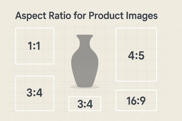
| 1:1 | 1080×1080, 2048×2048, 3000×3000 | Social feeds, avatars, product shots |
| 9:16 (portrait) | 1080×1920, 1440×2560 | Stories, Shorts, Reels |
Note: Some laptop panels (e.g., 1366×768) are near-16:9. Treat them as 16:9 for practical layout decisions.
Conversions: From Resolution ↔ Aspect Ratio
Find Aspect Ratio from a Resolution
- Find the greatest common divisor (GCD) of
widthandheight. - Divide both by the GCD.
- Express as
W:H.
Examples:
- 3840×2160 → GCD 240 → 16:9
- 3440×1440 → GCD 80 → 43:18 (≈ 21:9 ultrawide)
- 1366×768 → GCD 2 → 683:384 (≈ 16:9)
- 3000×2000 → GCD 1000 → 3:2
Compute a Resolution for a Known Aspect Ratio
Given ratio a:b and a target width W, height is H = round(W × b ÷ a). For a target height H, width is W = round(H × a ÷ b).
Examples:
- Need 16:9 at 1200px wide →
H = 1200 × 9 ÷ 16 = 675→ 1200×675 - Need 4:5 at 1350px tall →
W = 1350 × 4 ÷ 5 = 1080→ 1080×1350
Copy-paste helpers (optional)
// JavaScript: get aspect ratio from resolution
function aspectRatioFromResolution(w, h){
  const gcd = (a,b) => b ? gcd(b, a % b) : a;
  const g = gcd(w,h);
  return `${w/g}:${h/g}`;
}

// JavaScript: compute matching height for a given width & ratio a:b
function heightForRatio(width, a, b){
  return Math.round(width * b / a);
}
Need it done instantly? Try our Aspect Ratio Calculator to convert between ratios and resolutions in seconds.
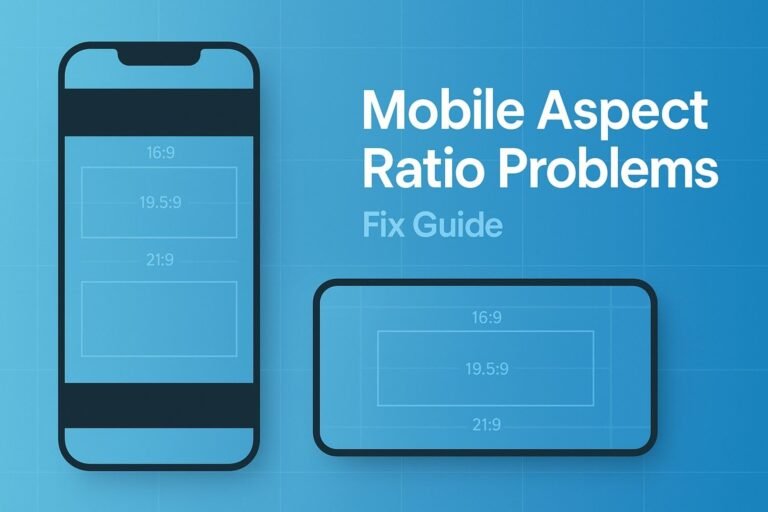
When They Don’t Match: Crop, Letterbox, or Stretch?
- Crop (recommended): Trim edges to fit the new aspect ratio. No distortion, best visual quality.
- Letterbox/Pillarbox: Add bars top-bottom or left-right to preserve the entire frame.
- Stretch (avoid): Warps the image; use only for deliberate stylistic effects.
Pro tip: For portrait social video (9:16) sourced from 16:9, re-frame and crop instead of stretching faces.
What to Use for Web, Photo, Video & Gaming
Web & UI Design
- Pick the aspect ratio to match the container (
16:9hero,1:1cards,4:5product portraits). - Export multiple resolutions for responsive images (e.g., 640, 1280, 1920) using
srcset. - CSS quick-start:
.media { aspect-ratio: 16 / 9; }
.media img { width: 100%; height: 100%; object-fit: cover; }
Photography
- Many sensors are
3:2(full-frame/APS-C) or4:3(Micro Four Thirds). Crop to deliverables like16:9(web) or4:5(Instagram). - Maintain higher working resolution in post; downscale for final delivery to trim size without changing aspect ratio.
Video & Streaming
- Standard landscape:
16:9at 1080p, 1440p, or 4K. Vertical:9:16at1080×1920. - Match the timeline aspect ratio to the final platform; pick resolution based on bitrate and device performance.
Gaming
- Use your monitor’s native aspect ratio; lower the resolution within that ratio to boost FPS (e.g., 1600×900 on a 1080p 16:9 display).
- Ultrawide (~21:9) expands horizontal FOV; verify UI support to avoid stretching.
PPI/DPI vs Resolution (Bonus Clarification)
Resolution is total pixels; PPI/DPI is pixel/ink density. On screens, PPI affects how big those pixels appear. For print, DPI/PPI and physical size together determine output quality. You can keep the same resolution and get different print sizes by changing DPI.
Export Settings & Pro Workflow Tips
- Choose aspect ratio first (canvas/artboard/timeline), then resolution.
- Don’t over-upscale. If needed, use high-quality scaling (bicubic/supersampling); AI upscalers can help but may invent details.
- Keep masters. Export web finals as WebP/AVIF/JPEG; for print, use TIFF or press-ready formats.
- Consistent filenames:
project-16x9-1920x1080.webpto avoid mix-ups.
FAQs
Are aspect ratio and resolution the same?
No. Aspect ratio is shape (e.g., 16:9). Resolution is pixel dimensions (e.g., 1920×1080). Many resolutions can share one ratio.
Does increasing resolution change the aspect ratio?
No. Scaling from 1920×1080 to 3840×2160 keeps 16:9—just with more pixels.
Which is better: 16:9 or 16:10?
Depends. 16:10 gives more vertical space for productivity; 16:9 matches most video and projectors.
How do I avoid black bars?
Export in the same aspect ratio as the display or platform. If they differ, crop or accept letterboxing/pillarboxing.
1-Minute Publishing Checklist
- ✅ Confirm your aspect ratio matches the destination (web, social, print, screen).
- ✅ Pick a resolution inside that ratio (balance quality vs size/performance).
- ✅ If ratios differ, choose to crop or letterbox (don’t stretch).
- ✅ Export multiple sizes for responsive delivery on the web.
- ✅ Need conversions? Use our Aspect Ratio Calculator.