Shortcut: Get instant, perfectly rounded sizes with our Aspect Ratio Calculator.
Key takeaways
- Aspect ratio is the shape of your frame (
W:H), not the pixel count. - Keep the ratio constant when resizing to avoid distortion.
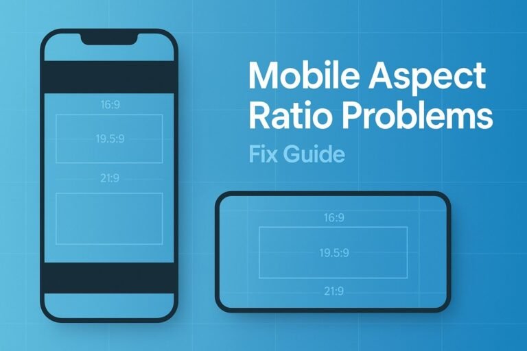
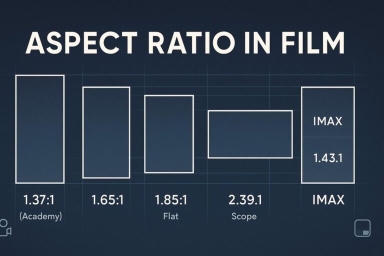
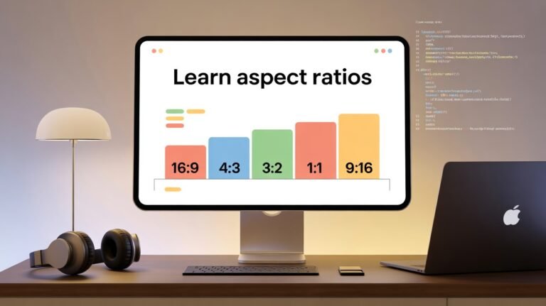
- Popular ratios: 16:9 (video), 4:3 (photos/slides), 3:2 (DSLR), 1:1 (square), 9:16 (vertical), 64:27 (~21:9 ultrawide).
- Use CSS
aspect-ratioandheight:autoto preserve shapes on responsive sites. - Fast path: use the Aspect Ratio Calculator or see the chart below.
What is aspect ratio? (definition)
Aspect ratio is the proportional relationship between width and height, written as W:H. For example, 16:9 means for every 16 units of width there are 9 units of height. Units can be pixels, inches, or centimeters—the ratio itself is unitless.
Different resolutions can share one ratio. For instance, 1920×1080 and 1280×720 are both 16:9.
Aspect ratio vs resolution vs orientation
| Concept | Meaning | Example |
|---|---|---|
| Aspect ratio | Shape only (W:H) | 16:9, 3:2, 1:1 |
| Resolution | Exact pixel dimensions | 3840×2160, 3000×2000 |
| Orientation | Landscape vs portrait | 16:9 vs 9:16 |
| Pixel aspect ratio (PAR) | Shape of each pixel | Square (1.0) in modern displays |
Aspect ratio formula (the quick math)
Reduce width W and height H by their greatest common divisor (GCD):
Aspect ratio = (W ÷ GCD(W, H)) : (H ÷ GCD(W, H))Resize without distortion by solving for the missing side:
- Given new width:
newHeight = round(newWidth × H / W) - Given new height:
newWidth = round(newHeight × W / H)
Worked examples you can copy
Example 1 — Reduce a resolution to its ratio
4032×3024 → GCD(4032, 3024) = 1008 → 4:3.
Example 2 — Popular 4K frame
3840×2160 → GCD 240 → 16:9.
Example 3 — Vertical portrait feed
1080×1350 → GCD 270 → 4:5.
Example 4 — Cinematic nuance
4096×2160 → GCD 16 → 256:135 (~1.90:1, often marketed as “17:9”).
Example 5 — Find missing height
Need 3:2 at width 1200 → 1200 × 2 ÷ 3 = 800 → 1200×800.
Example 6 — Find missing width
Need 16:9 at height 1080 → 1080 × 16 ÷ 9 = 1920 → 1920×1080.
Common aspect ratios chart
| Ratio | Decimal | Best for | Landscape example | Portrait example |
|---|---|---|---|---|
| 16:9 | 1.78 | HD/4K video, slides, web | 1920×1080 | 1080×1920 (9:16) |
| 4:3 | 1.33 | Photography, decks, legacy | 1600×1200 | 1200×1600 (3:4) |
| 3:2 | 1.50 | DSLR photos, prints | 3000×2000 | 2000×3000 (2:3) |
| 1:1 | 1.00 | Thumbnails, avatars | 1080×1080 | — |
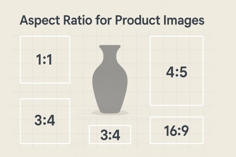
| 4:5 | 0.80 | Portrait feed posts | — | 1080×1350 |
| 64:27 (~21:9) | 2.37 | Ultrawide monitors, cinema feel | 2560×1080 | — |
| 5:4 | 1.25 | Some monitors, portraits | 1280×1024 | 1024×1280 (4:5) |
Need exact sizes? Use the Aspect Ratio Calculator for one-click math.
How to choose the right ratio
- Match the platform. Landscape video defaults to 16:9; vertical video favors 9:16; portrait feeds often prefer 4:5.
- Compose for the final crop. If you’ll post 4:5 later, frame subjects with that shape in mind.
- Design responsively. Expect wider desktops and taller phones; check both orientations.
- Mind print sizes. Posters and photo papers have fixed ratios—start with the output in mind.
- Tell the right story. Wider frames feel cinematic; tighter frames feel intimate.
Mistakes to avoid
- Stretching: scaling width and height separately breaks the ratio and distorts faces and logos.
- Random cropping: unlocks the ratio and cuts important content.
- Letterbox/pillarbox shock: mismatched ratios add bars; if unavoidable, style them to match your brand.
- Over-rounding: round once at the end to avoid compounding pixel errors.
Aspect ratio on the web (CSS)
Modern browsers support the CSS aspect-ratio property; no padding hacks needed.
.responsive-media { aspect-ratio: 16 / 9; width: 100%; }
img.responsive   { width: 100%; height: auto; }
Add descriptive alt text and lazy-load large images for performance.
FAQ
Is aspect ratio the same as resolution?
No. Aspect ratio is a proportion (e.g., 16:9). Resolution is the pixel dimensions (e.g., 1920×1080). Many resolutions can share one ratio.
Does DPI change aspect ratio?
No. DPI/PPI changes print density and perceived sharpness, not the width-to-height proportion.
How do I find aspect ratio from pixels?
Divide width and height by their greatest common divisor. Example: 3000×2000 → GCD 1000 → 3:2.
What’s the best aspect ratio for video?
Landscape video is typically 16:9; vertical formats like Shorts/Reels/TikTok use 9:16. Choose based on platform and audience.
Where can I calculate or convert sizes quickly?
Use the on-page tool above or our dedicated Aspect Ratio Calculator.