Quick tool: Need exact dimensions? Use the free Aspect Ratio Calculator to convert any width/height without distortion.
Key Takeaways
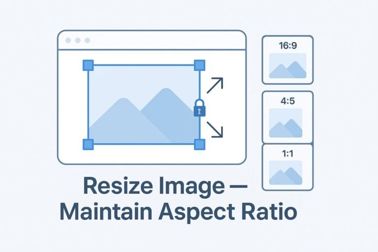
- Preserve proportions: scale both sides by the same factor, or let the browser do it with
height:autoandaspect-ratio. - Fit vs Fill: Fit shows everything (may letterbox); Fill covers the box (may crop).
- Prevent layout shift (CLS): always set intrinsic
width/heightor a containeraspect-ratio. - Use modern formats: WebP/AVIF +
srcset/sizesfor crisp images and fast loads.
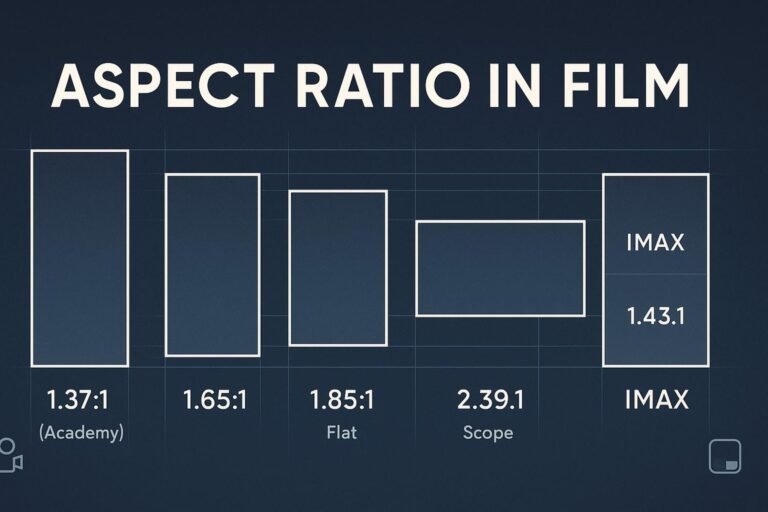
What is aspect ratio?
Aspect ratio is the width-to-height relationship (e.g., 16:9, 1:1, 4:5). A 1200×800 image is 3:2 because 1200/800 simplifies to 3/2. To maintain it while resizing, scale both sides equally.
The 30-second math (fit-in-box)
scale = min(targetW / srcW, targetH / srcH)
newW  = round(srcW * scale)
newH  = round(srcH * scale)
Fit ensures the whole image is visible (no distortion). To fill a box and crop the overflow, use scale = max(...) and then crop edges.
- 3:2 at width 1200 → height = 1200 × 2/3 = 800
- 4:5 at width 1080 → height = 1080 × 5/4 = 1350
- 16:9 at width 1920 → height = 1920 × 9/16 = 1080
Quick answers & copy-paste code
Keep proportions for <img>
img.responsive { max-width: 100%; height: auto; display: block; }Reserve space to avoid CLS
<img
  class="responsive"
  src="/images/hero-1600x900.jpg"
  width="1600" height="900"  /* preserves ratio, reserves space */
  alt="Responsive 16:9 hero image"
  loading="lazy" decoding="async"
  srcset="/images/hero-800x450.jpg 800w,
          /images/hero-1200x675.jpg 1200w,
          /images/hero-1600x900.jpg 1600w"
  sizes="(max-width: 800px) 100vw, 800px"
/>
Fixed-ratio containers (cards, video)
.ratio-16x9 { aspect-ratio: 16 / 9; width: 100%; border-radius: 12px; overflow: hidden; }
.ratio-1x1  { aspect-ratio: 1 / 1;  width: 100%; border-radius: 12px; overflow: hidden; }
.ratio-4x5  { aspect-ratio: 4 / 5;  width: 100%; border-radius: 12px; overflow: hidden; }
.ratio-16x9 > * { width: 100%; height: 100%; border: 0; }
Background images—choose Cover or Contain
.bg-cover   { background-size: cover;   background-position: center; }
.bg-contain { background-size: contain; background-repeat: no-repeat; background-position: center; }
One-liner to compute the missing side
const height = Math.round(width * h / w); // given ratio w:hResize in CSS/HTML (without distortion)
1) Standard <img> elements
Use max-width:100% and height:auto. Always include the image’s intrinsic width and height attributes so the browser reserves the correct box.
2) Aspect-ratio containers (modern CSS)
<div class="ratio-16x9">
  <iframe src="https://www.youtube.com/embed/ID" title="Video demo" loading="lazy" allowfullscreen></iframe>
</div>
For portrait reels, switch to aspect-ratio: 9 / 16.
3) Background images
cover = fill + crop edges; contain = fit inside + letterbox. Pick per component.
4) Pre-aspect-ratio fallback (optional)
.ratio-16x9 { position: relative; width: 100%; padding-top: 56.25%; } /* 9/16 */
.ratio-16x9 > * { position: absolute; inset: 0; width: 100%; height: 100%; }
Photoshop, GIMP, Figma/Canva
Photoshop
- Image → Image Size… (enable the chain to constrain proportions).
- Change width or height; Photoshop updates the other side.
- For downscaling, choose Bicubic Sharper. Export via Export As….
GIMP
- Image → Scale Image… (lock the chain icon).
- Enter the new width or height, choose Cubic/LoHalo, then Scale.
Figma / Canva
- Put the image in a frame with the target size.
- Set the image to Fill (crop overflow) or Fit (letterbox).
- Export WebP/PNG at appropriate density (1x/2x).
Command line: ImageMagick
Fit inside a box (keep aspect, no crop):
magick input.jpg -resize 1200x800 output.jpgFill a box (keep aspect, then crop overflow):
magick input.jpg -resize 1200x800^ -gravity center -extent 1200x800 output.jpgBy one side only:
magick input.jpg -resize 1200x output.jpg   # width=1200, height auto
magick input.jpg -resize x800   output.jpg   # height=800, width auto
Python: Pillow (PIL)
from PIL import Image

def resize_fit(path_in, path_out, target_w=None, target_h=None):
    img = Image.open(path_in)
    src_w, src_h = img.size
    if not target_w and not target_h:
        raise ValueError("Provide target_w or target_h")
    if target_w and target_h:
        scale = min(target_w / src_w, target_h / src_h)
    elif target_w:
        scale = target_w / src_w
    else:
        scale = target_h / src_h
    new_size = (round(src_w * scale), round(src_h * scale))
    img = img.resize(new_size, Image.LANCZOS)
    img.save(path_out, optimize=True, quality=85)

# Example
resize_fit("input.jpg", "output.jpg", target_w=1200, target_h=800)
Web performance & SEO (no CLS)
- Reserve space: add
width/heightattributes or wrap media in a setaspect-ratio. - Responsive images: pair
srcset+sizeswith modern formats (WebP/AVIF) and JPEG fallbacks. - Lazy below the fold:
loading="lazy"anddecoding="async"are safe defaults. - Consistent design system: pick 1–2 ratios per component (cards 4:5, heroes 16:9, avatars 1:1) for a professional look.
- Helpful internal links: link “aspect ratio,” “image sizing,” and “calculate dimensions” to your cornerstone tools, like the Aspect Ratio Calculator.
Common mistakes (and fixes)
- Stretching images: don’t set arbitrary width & height—use
height:autoor a ratio container. - CLS jumps: missing intrinsic size. Fix by adding
width/heightoraspect-ratio. - Wrong semantics: important visuals should be
<img>(with alt text), not CSS backgrounds. - DPI confusion: on the web, pixel dimensions matter; DPI is for print.
- No plan for exact boxes: decide up front: contain (letterbox) or cover (crop).
FAQ
How do I resize an image and maintain aspect ratio in CSS?
Add max-width:100% and height:auto. For fixed shapes, wrap media in an aspect-ratio container and let content fill it.
How can I fit an image inside a box without distortion?
Use the fit-in-box formula: scale=min(targetW/srcW, targetH/srcH). In ImageMagick, plain -resize W×H does this.
How do I fill a box and crop the excess?
Scale to cover, then crop. In ImageMagick: -resize W×H^ + -extent W×H.
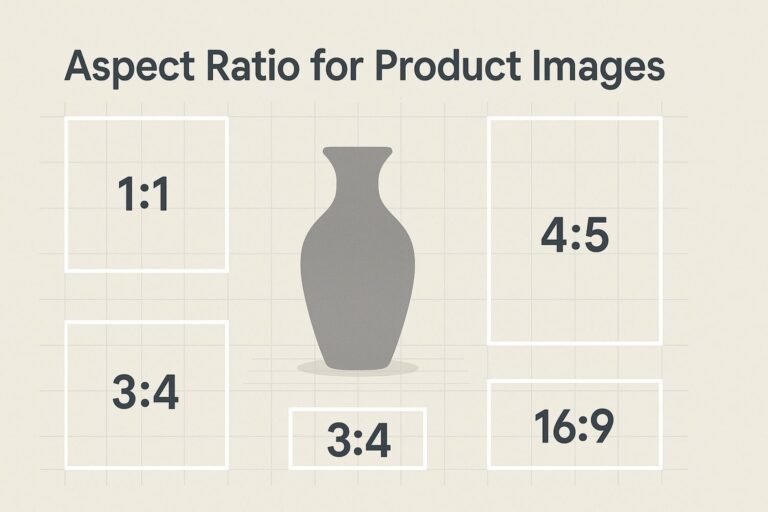
What’s the best ratio for thumbnails and social previews?
Common: 1:1 (square), 4:5 (portrait feeds), and 16:9 (video/link previews). Pick one per component for consistency.