From YouTube and ultrawide monitors to Instagram Reels and A-series paper, aspect ratios shape how your visuals look and feel. This practical, human-written guide explains the most common aspect ratios, when to use each, exact pixel examples, and the math to resize without distortion.
Short on time? Use our free Aspect Ratio Calculator to convert sizes instantly.
What Is Aspect Ratio?
Aspect ratio expresses frame shape as width:height. Two images share the same aspect ratio if their width ÷ height is equal—even if their pixel counts differ. For example, 1920×1080 and 1280×720 are both 16:9.
Display vs Pixel Aspect Ratio (DAR vs PAR)
Display Aspect Ratio (DAR) is the visible shape (e.g., 16:9). Pixel Aspect Ratio (PAR) describes whether individual pixels are square (1:1) or not. Modern screens and workflows typically use square pixels, so DAR and the simplified ratio match. If legacy footage looks stretched, verify PAR first.
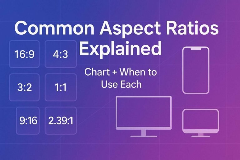
Quick Chart: Common Aspect Ratios
Decimals are width ÷ height. “Examples” show popular pixel sizes that simplify to the ratio.
| Ratio (W:H) | Decimal | Typical Uses | Example Pixel Sizes |
|---|---|---|---|
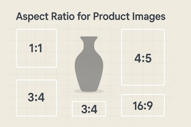
| 1:1 | 1.00 | Avatars, square feeds, product grids | 1080×1080, 1500×1500 |
| 4:5 | 0.80 | Instagram portrait posts | 1080×1350 |
| 5:4 | 1.25 | Fine-art prints, legacy monitors | 1280×1024, 2560×2048 |
| 4:3 | 1.33 | Slides, some camera sensors | 1024×768, 1600×1200, 4000×3000 |
| 3:2 | 1.50 | 35mm/full-frame photo, prints | 3000×2000, 6000×4000 |
| 16:10 | 1.60 | Laptop/monitor workspaces | 1920×1200, 2560×1600 |
| 16:9 | 1.78 | HD/4K video, slides, web heroes | 1280×720, 1920×1080, 3840×2160 |
| “17:9” cinema* | ≈1.89 | DCI container, pro cameras | 4096×2160 → 256:135 exact |
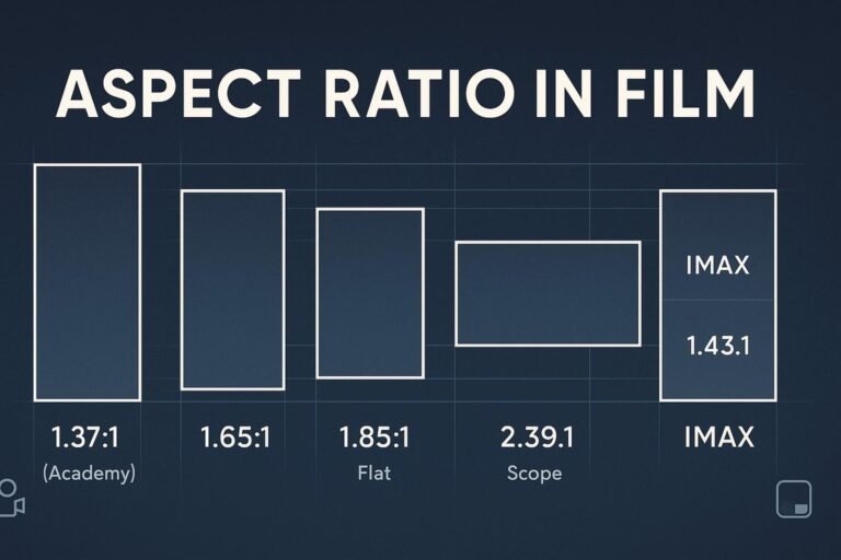
| 1.85:1 | 1.85 | Widescreen cinema (flat) | 1998×1080 (DCI), 3840×2076 |
| 2:1 | 2.00 | Modern banners, cinematic feel | 2400×1200, 3200×1600 |
| 2.39:1 | 2.39 | Cinematic scope | 4096×1716, ~3840×1607 |
| 64:27 | 2.37 | Ultrawide monitors | 2560×1080 |
| 43:18 | 2.39 | Ultrawide monitors, panoramic UI | 3440×1440 |
| 9:16 | 0.56 | Reels, Shorts, Stories | 1080×1920, 1440×2560 |
| 1:√2 | 0.71 | A-series paper (A5, A4, A3…) | A4 = 210×297 mm (ratio 1:1.414) |
* Often labeled “17:9.” The exact simplification for 4096×2160 is 256:135 (≈1.896), which is close to but not exactly 17:9 (1.889).
When to Use Each Ratio (Practical Guidance)
- 16:9 — Default for slides, YouTube, web heroes; great balance of width and height.
- 1:1 — Uniform grids, profile images, product listings.
- 4:5 — Tall social posts with more screen real estate than 1:1.
- 9:16 — Full-screen mobile video (Reels/Shorts/Stories); design with safe areas.
- 3:2 — Full-frame photography; print friendly with minimal cropping.
- 4:3 — Presentations and sensors that benefit from more vertical headroom.
- 16:10 — Productivity dashboards; more vertical space than 16:9.
- 2:1 / 2.39:1 — Cinematic hero sections and filmic storytelling.
- Ultrawide (64:27, 43:18) — Panoramic datasets, immersive UI screenshots.
- 1:√2 (A-series) — Print layouts that scale between sizes without changing shape.
The Math: Simplify & Convert Any Size
Find a size’s aspect ratio (exact)
- Write your width and height (e.g.,
3440×1440). - Find the greatest common divisor (GCD).
- Divide both by the GCD →
3440/80 = 43,1440/80 = 18→ 43:18.
Compute a missing side from a known ratio
height = targetWidth  × (H / W)
width  = targetHeight × (W / H)
Example: 16:9 banner at 1200px wide → height = 1200 × 9/16 = 675 → 1200×675.
Prefer a no-math approach? Use our Aspect Ratio Calculator—enter one side and a target ratio to get a pixel-perfect match in seconds.
Resizing Without Distortion (Pro Tips)
- Scale proportionally: Change both sides by the same factor to preserve shape.
- Letterbox/Pillarbox: Add padding bars to fit a wider/narrower frame without cropping.
- Crop with intent: When converting shapes (e.g., 4:3 → 16:9), reframe your subject.
- Mind platform UI: Keep titles/logos away from edges so captions and buttons don’t cover them.
Keep Aspect Ratio in CSS (Modern + Fallback)
Modern property (cleanest)
.media {
  aspect-ratio: 16 / 9;   /* any ratio W / H */
  width: 100%;
  height: auto;
  object-fit: cover;       /* for images/videos inside */
}
Padding-top fallback (works everywhere)
.ratio-16x9 { position: relative; width: 100%; }
.ratio-16x9::before { content: ""; display: block; padding-top: calc(9 / 16 * 100%); }
.ratio-16x9 > .content { position: absolute; inset: 0; }
Swap the numbers for other shapes (e.g., 3/2 for 3:2, 5/4 for 5:4).
FAQ
What is the most common aspect ratio?
For screens and online video, 16:9 dominates. For vertical mobile video, 9:16 has become standard.
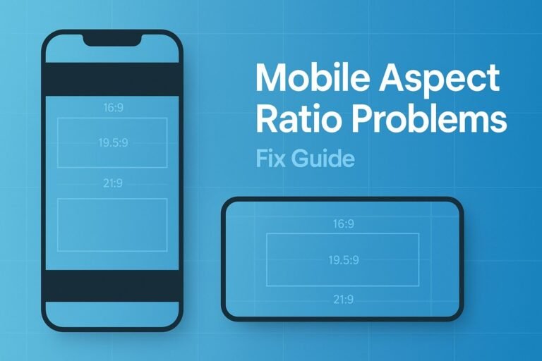
Is “21:9” a real ratio?
It’s a marketing shorthand. Popular ultrawide displays simplify to 64:27 (~2.37:1, e.g., 2560×1080) or 43:18 (~2.39:1, e.g., 3440×1440).
Does 4096×2160 equal 17:9?
It’s often labeled that way, but the exact simplification is 256:135 (~1.896). 17:9 is ~1.889.
How do I convert any size to its ratio?
Find the GCD of width and height, then divide both numbers by it. That gives you the simplest W:H.
What aspect ratio do A-series paper sizes use?
A-series paper uses a constant 1:√2 ratio (~1:1.414), so A5, A4, A3, etc., scale without changing shape.
Need Perfect Sizes, Fast?
Skip the math and avoid mistakes. Try our free Aspect Ratio Calculator—enter one side and get the matching dimension instantly.